BARCELONA / REMOTE
Designing a scalable identity system for a data company that had outgrown its category.
Netquest had evolved beyond traditional market research. Its brand hadn't.
My role
Led Brand Strategy, Visual Identity & Design System, working closely with UX/UI designers Santi Sanchez, Fran Cabeza, and Arnau Clavero. Cross-functional collaboration across Marketing, Product, Engineering, and external creative partners.
Business Context & Business Goals
Netquest combined surveys, geolocation, behavioural signals, audio matching, and passive data into a unified view of consumer behaviour.
Two distinct audiences, one generic experience. Agency researchers arrived looking for sample quality, fieldwork, and methodology. Marketing and research leaders arrived looking for business outcomes, strategic insights, and consumer understanding. The site spoke the first group's language. The second, increasingly the one making buying decisions, couldn't quickly understand what Netquest did or why it was different.
Business problem
The brand looked identical to every other data company in the market. The sales team needed a steady flow of qualified leads, but the website wasn't generating enough SQLs to support pipeline. The brand was failing both the buyer and the business at once.
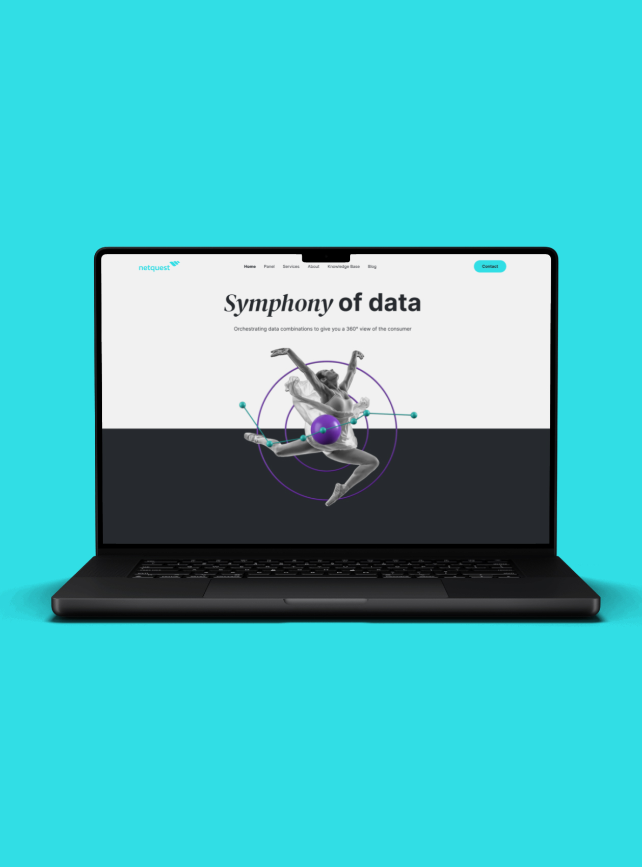
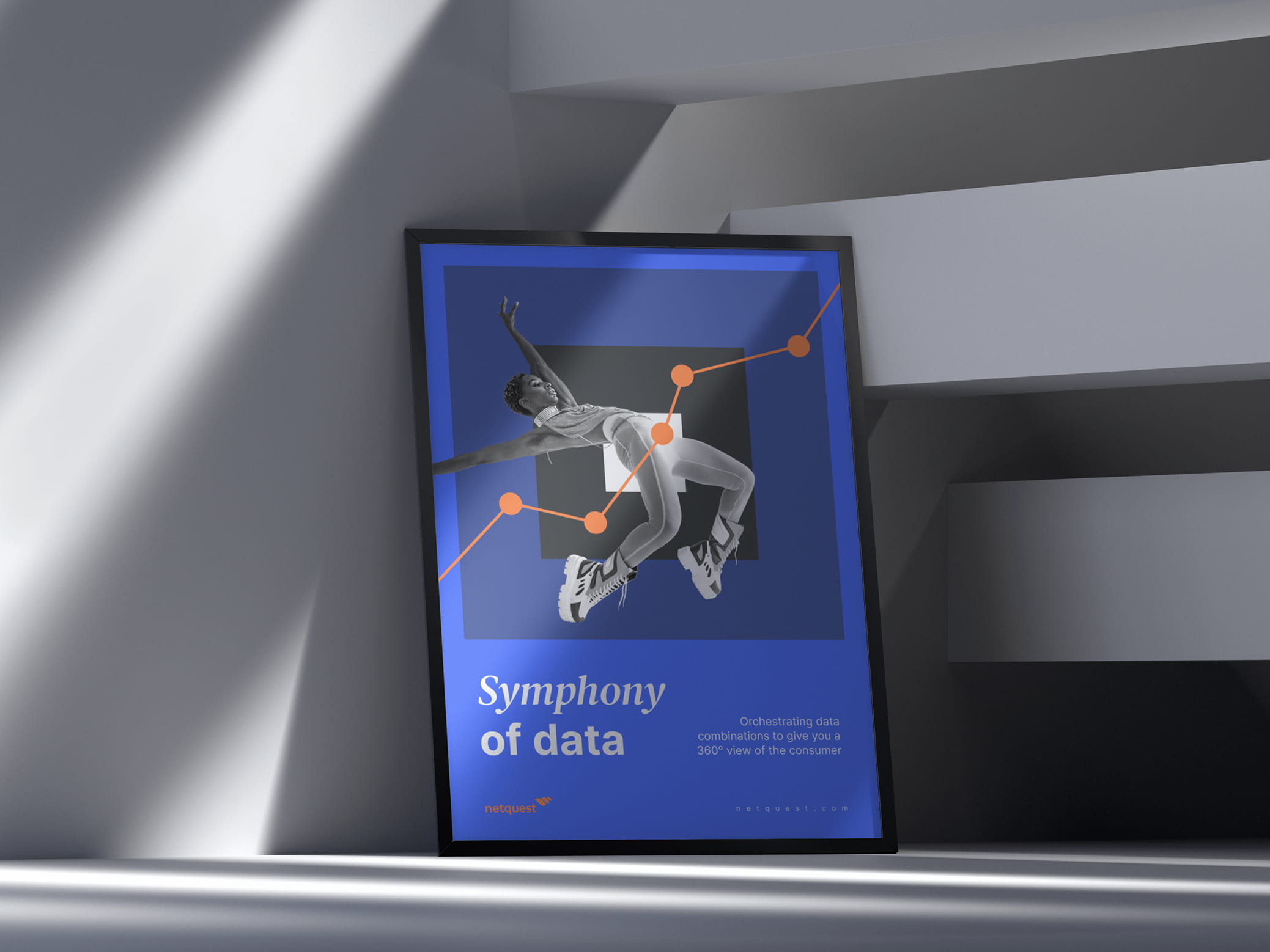
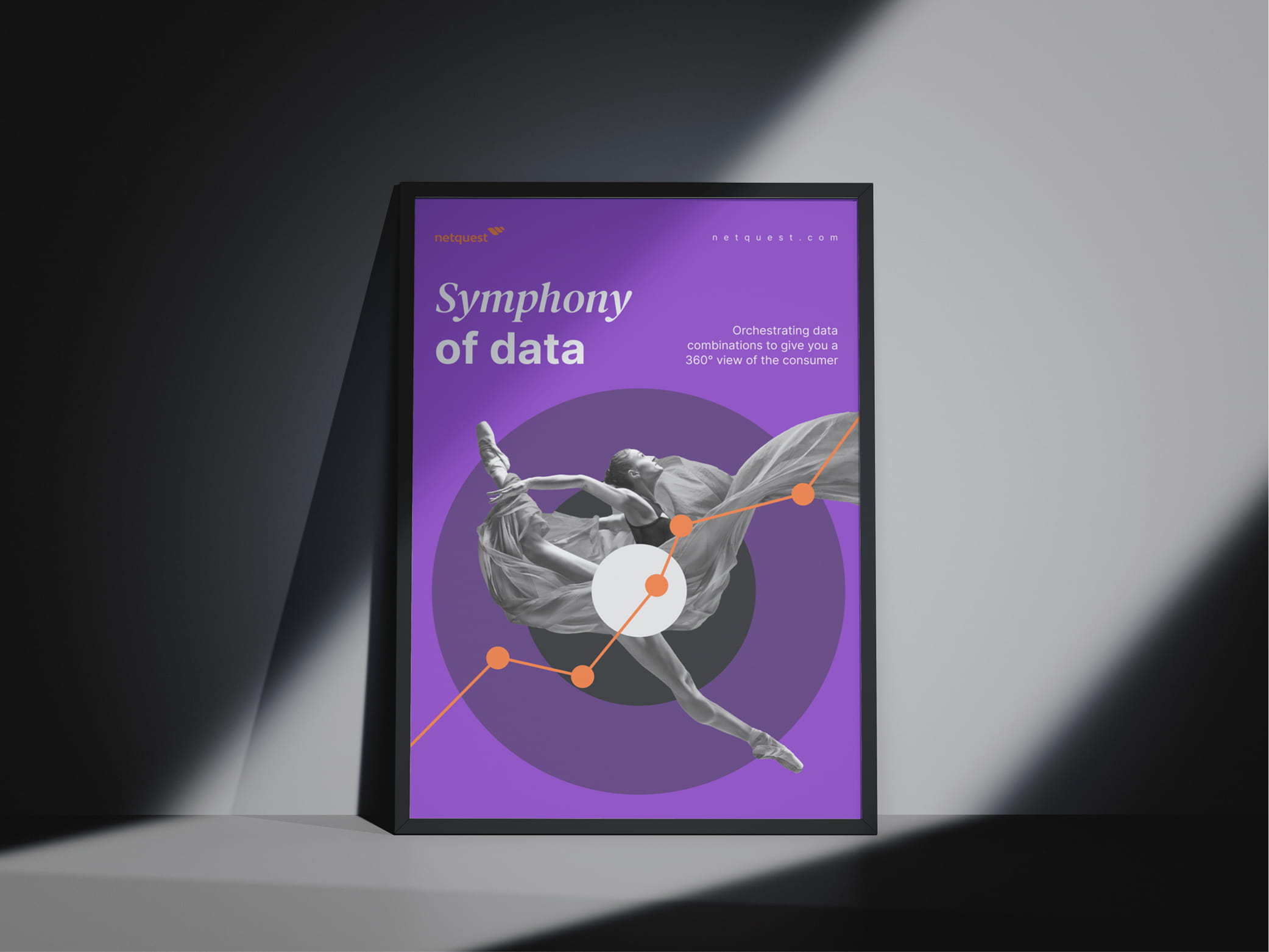
Visual language built from the Symphony of Data concept. Dancer as central metaphor. Frequencies, radial systems, rhythm, repetition. The palette gained brightness for digital environments where the brand mostly lives, and expanded in range to absorb the multiplicity of data types and products the system had to represent.
2 Design system in HubSpot
Modular component library built inside HubSpot, the CMS and CRM the marketing teams already used. Reusable page templates, email structures, landing page modules, tokenised architecture for multi-language and multi-team consumption. Built as primary infrastructure, not as a workaround.
3 Site rebuild and conversion architecture
Audience-led IA replacing methodology-first navigation. Servicios reorganised around research types. Soluciones built around buyer profiles and use cases. Pages turned from brochure copy into full marketing assets with multiple conversion moments, lead magnets, and qualifying form fields routing to sales.
Outcomes / Key Insights
Time-to-publish per landing page Measured before vs after a 6-month design system rollout
Driver: HubSpot-native design system with reusable templates and components.
Marketing and Marketing Automation, across ES, DE, EN, FR, IT, PT-BR, PT-PT

New visual identity
The visual identity moved Netquest away from abstract data iconography. The radial system and dancer replace the generic analytical aesthetic the category had converged on. Distinction by subtraction.


Color palette
Rebuilt for digital, where the brand mostly lives. Brighter than before, broader in range to carry the multiplicity of data types and products the identity has to represent.


Design system
The HubSpot-native design system. Tokenised type, colour, and spacing, with reusable components and templates that let Marketing and Marketing Automation teams ship landing pages and emails without returning to design. Consistency embedded into the components themselves.


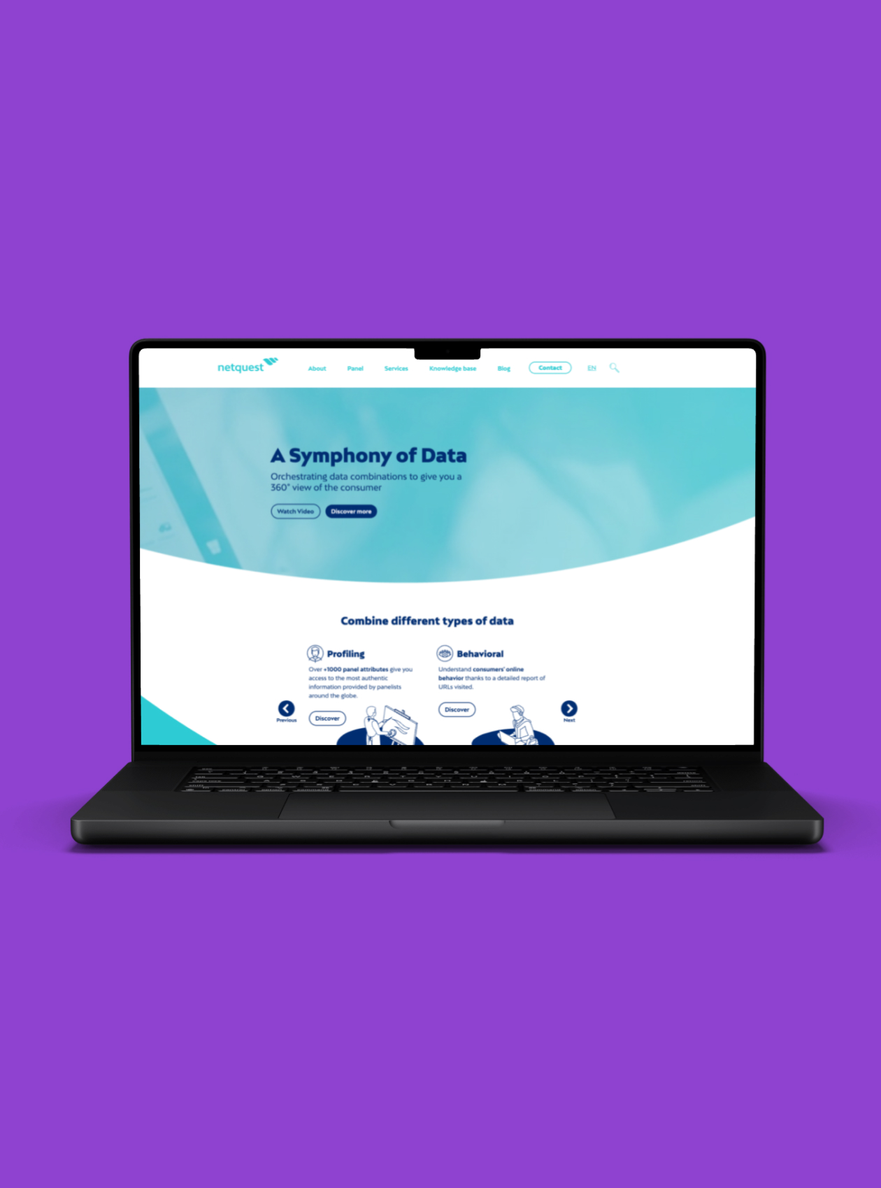
Website
The site was restructured around the audience the brand was actually speaking to: marketing leaders and strategic teams who needed clarity before complexity. New page hierarchy, navigation, and conversion paths built for buyers, not researchers.


Global rollout
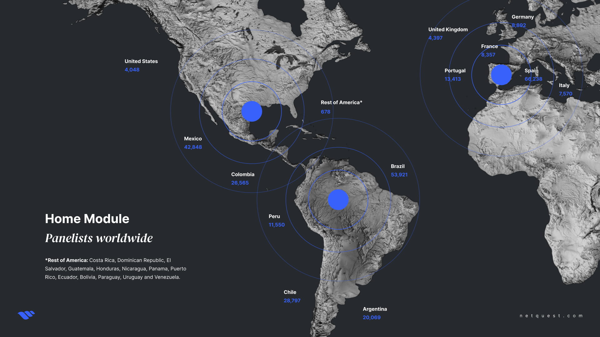
Seven languages: ES, DE, EN, FR, IT, PT-BR, PT-PT. Built centrally, rolled out across every market Netquest operates in.
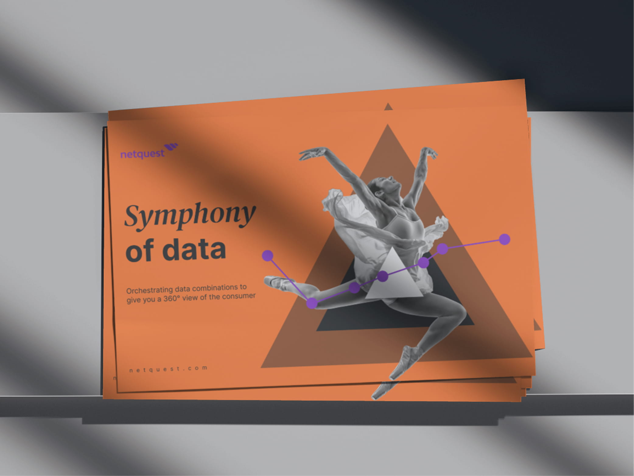
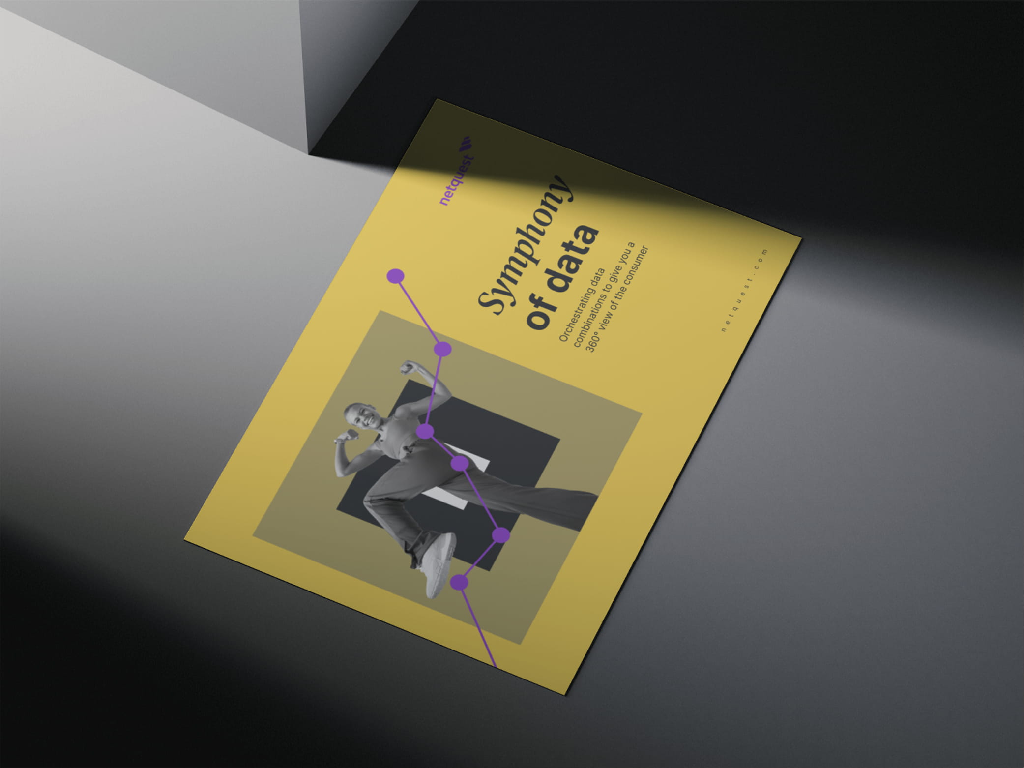


Out of home
The identity carries across out-of-home and editorial surfaces without collapsing into product visuals. The dancer holds at human scale. The system feels less like data and more like the people behind it.


DESIGN-DEPT.
Barcelona, Spain
Phone: +34 622 712 521
Email: fabioestellita@gmail.com
Linkedin: /in/fabioestellita/
Copyright © 2026 DESIGN DEPT.
All rights reserved.