BARCELONA / REMOTE
Designing a identity system for a global panel brand used by 850,000+ people.
Evolving a brand without breaking what people trust about it and that set the foundation for future GfK panels.
My role
I led the rebrand from a brand and visual identity perspective, defining the strategic direction, designing the new identity, and building the UI system that translated it into real product and marketing experiences across eight markets.
Business Context & Business Goals
Outcomes / Key Insights
The Nicequest system became the visual and operational foundation for the One Panel / Evolv initiative, GfK's effort to unify its global panel ecosystem. The relationship became bidirectional: Nicequest's UI Kit informed One Panel's architecture, and One Panel's design system later fed improvements back into Nicequest. The rebrand had become infrastructure, not just a new identity.
Same survey base, 8 countries, March 2021. Consistent across all 8 markets surveyed.
Driver: identity system built for trust-first communication, with colour, type, and tone integrated across panelist-facing touchpoints.
Same survey base. Approachable, Trustworthy, Serious, Transparent, Honest, measured on a 0 to 10 scale. Best scores in Mexico.
Overview
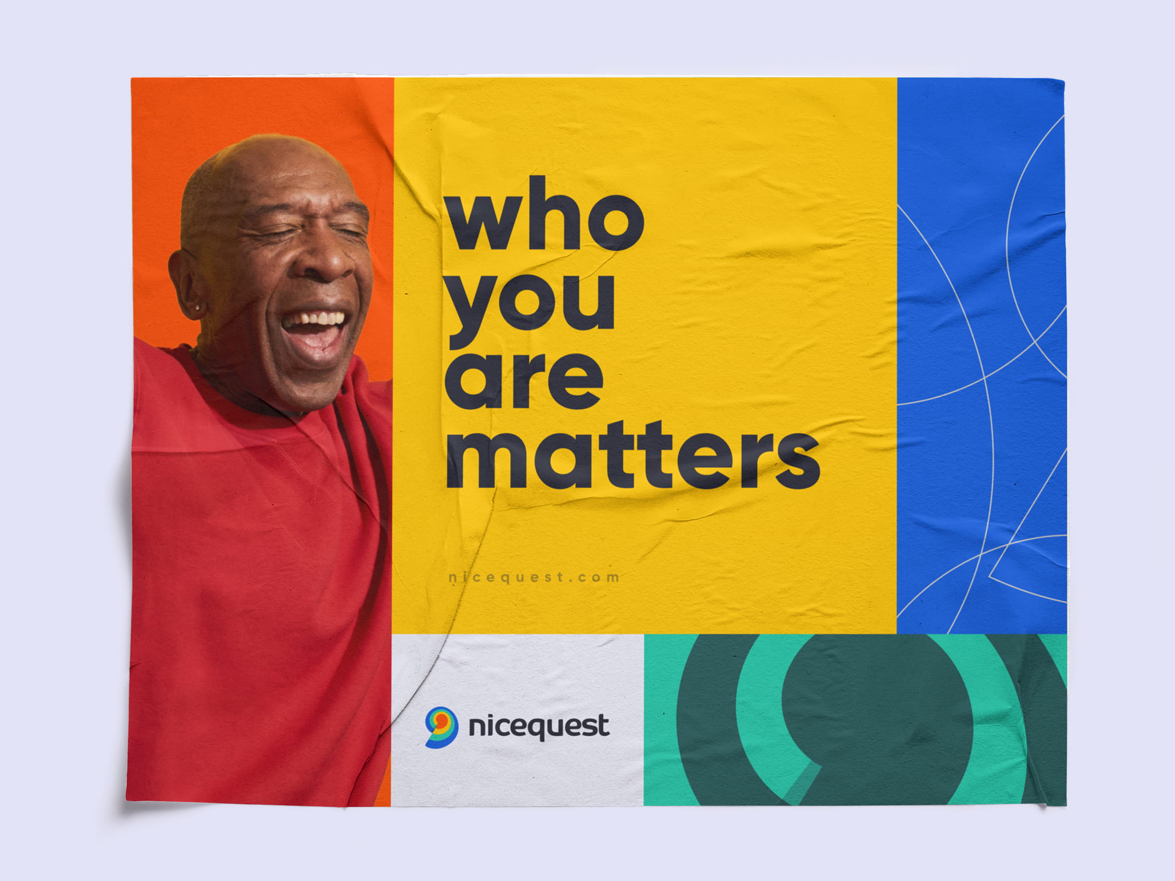
From mark to colour to product surfaces to the infrastructure behind them. A complete identity system designed to preserve trust at scale, across 20+ countries and every surface panelists touch.

The Nicequest project was featured on Brand New site that showcases noteworthy logo and identity work.


5 seconds
People were asked to draw the Nicequest logo from memory in five seconds. Most couldn't reproduce the actual symbol. Almost everyone drew the same thing: a spiral.


Brand
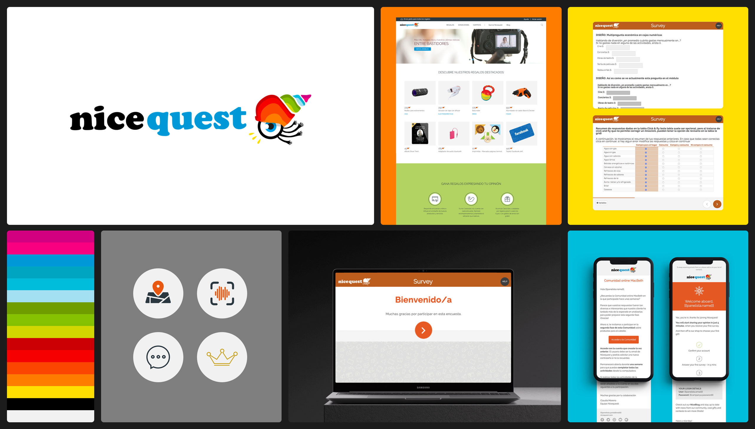
The original shell became a spiral. The mark evolved, it wasn't replaced. At small sizes it reads as a clean, recognisable symbol. At larger scales it opens into an expressive graphic language for movement and participation.


Color pallete
The colour system drew from behavioural heat maps and digital activity patterns. Vibrant enough to build recognition across surfaces, controlled enough to coexist with product UI without competing with it.


")


Applications
The identity carries across physical and digital touchpoints without being rigid. The spiral anchors each piece while the colour and type system handle the variation.


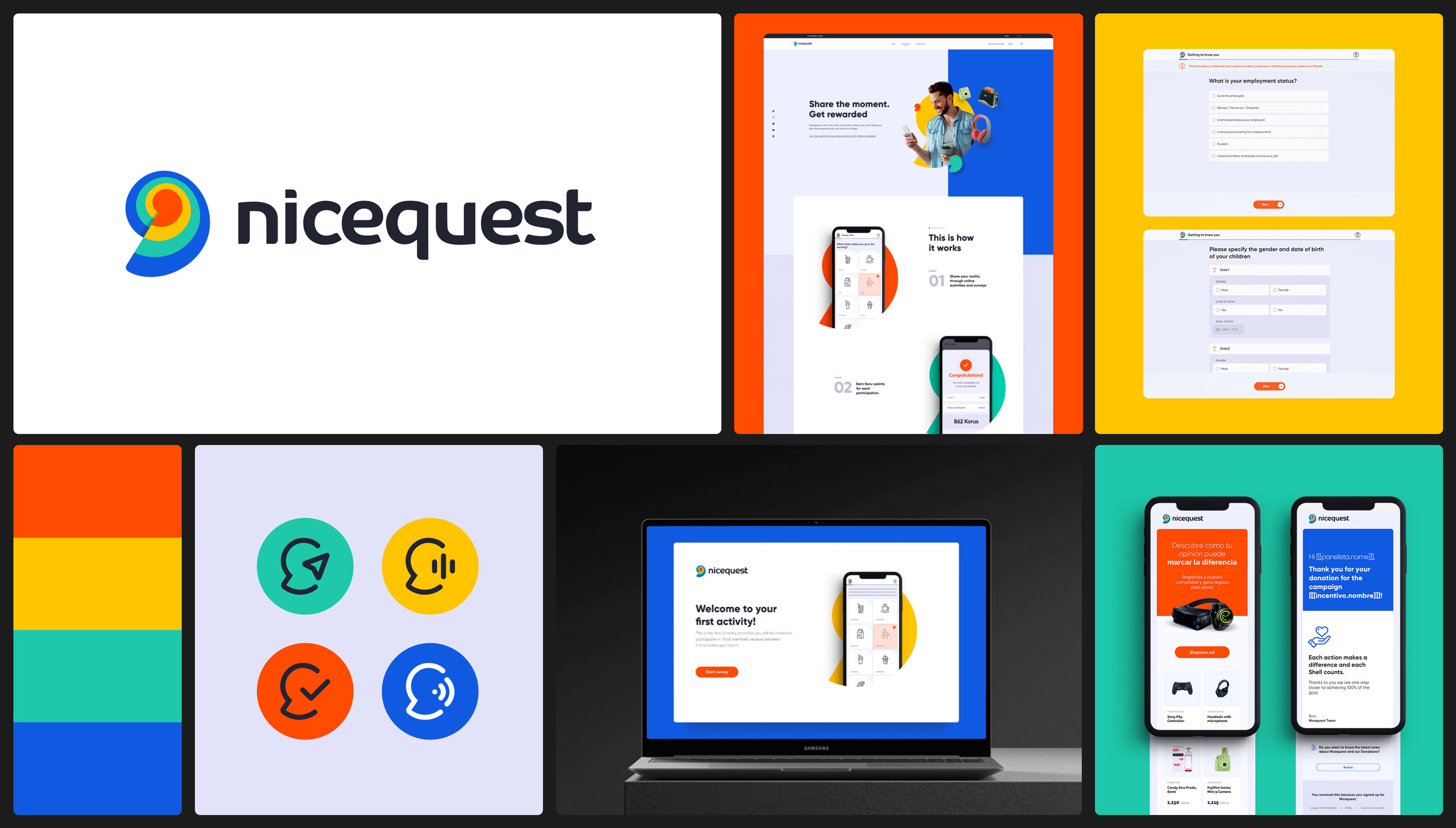
Product
The identity reaches panelists through every surface they touch: onboarding flows, survey interfaces, profile screens, and web structures. Each context adapts the visual language without losing coherence.


Website
The identity reaches panelists before they open the app. The website carries the same visual language across acquisition, rewards, and community, adapting tone without breaking consistency.
DESIGN-DEPT.
Barcelona, Spain
Phone: +34 622 712 521
Email: fabioestellita@gmail.com
Linkedin: /in/fabioestellita/
Copyright © 2026 DESIGN DEPT.
All rights reserved.