BARCELONA / REMOTE


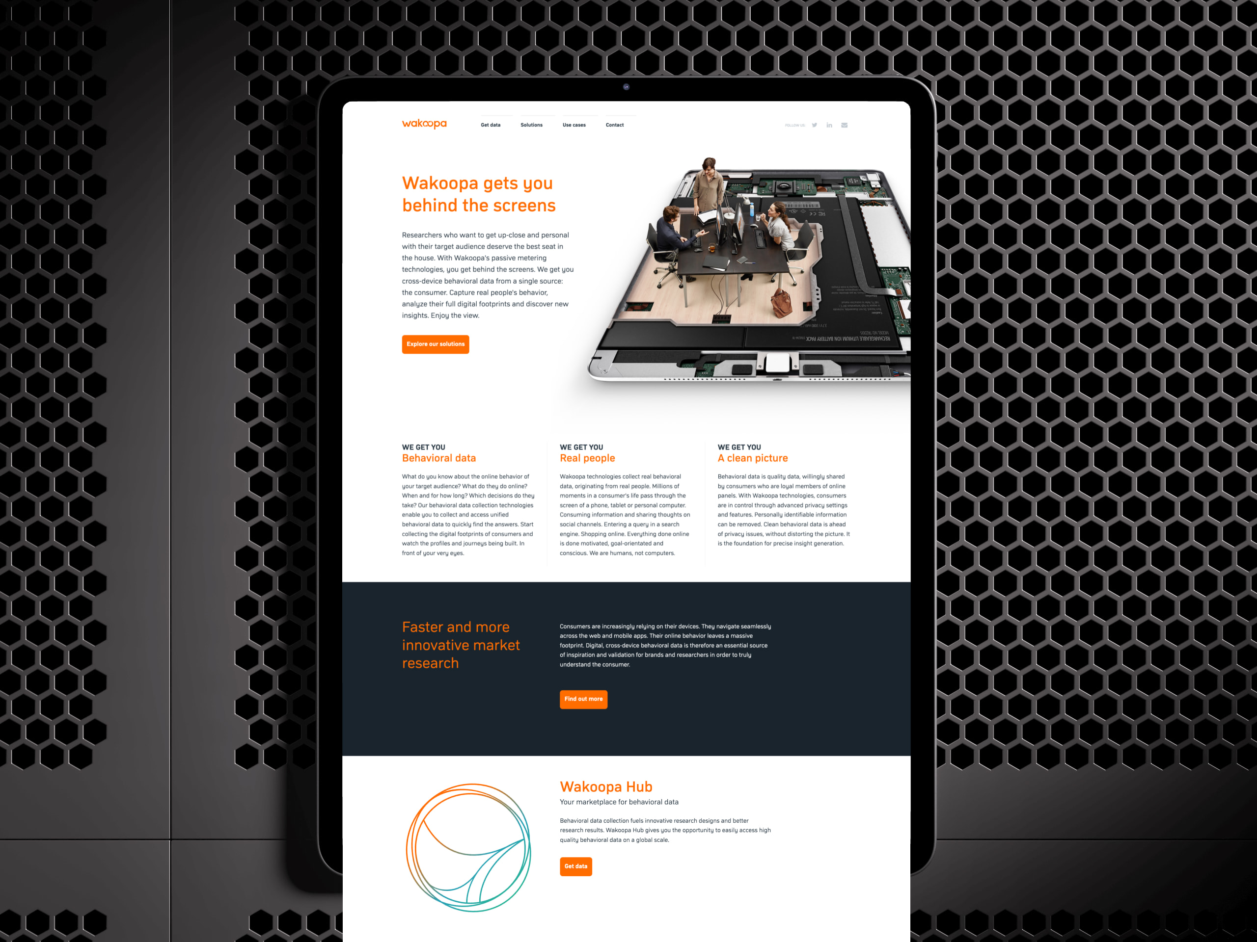
Depositioning Wakoopa from generic software vendor to specialist platform.
Clarifying positioning through audience-specific brand and digital experience.
My role
Creative Direction, Brand Identity, and Digital Experience. I owned the visual system and website redesign. UXUI Designer Fran Cabeza and working closely with Product, Engineering, and Marketing across the full project lifecycle.
Learnings
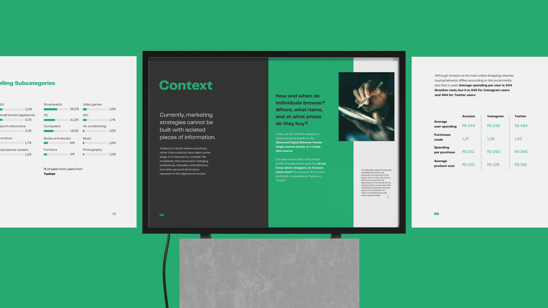
Around 1K sessions in Q3 2022 to a peak of 4.2K in Q2 2023, Wakoopa.com analytics. A niche B2B passive metering product, where the audience is small and specific by nature.
Driver: Site restructured around two clear buyer journeys, For Panels and For Brands, each audience receiving language, navigation, and conversion paths designed for them specifically.
Bounce rate down 10pp year over year. HubSpot website analytics, measured across 2023. For a niche B2B product with long sales cycles and high contract value, even small conversion gains translate to meaningful pipeline.
Driver: Audience-specific page hierarchy, navigation, and CTAs designed around the two buyer journeys.


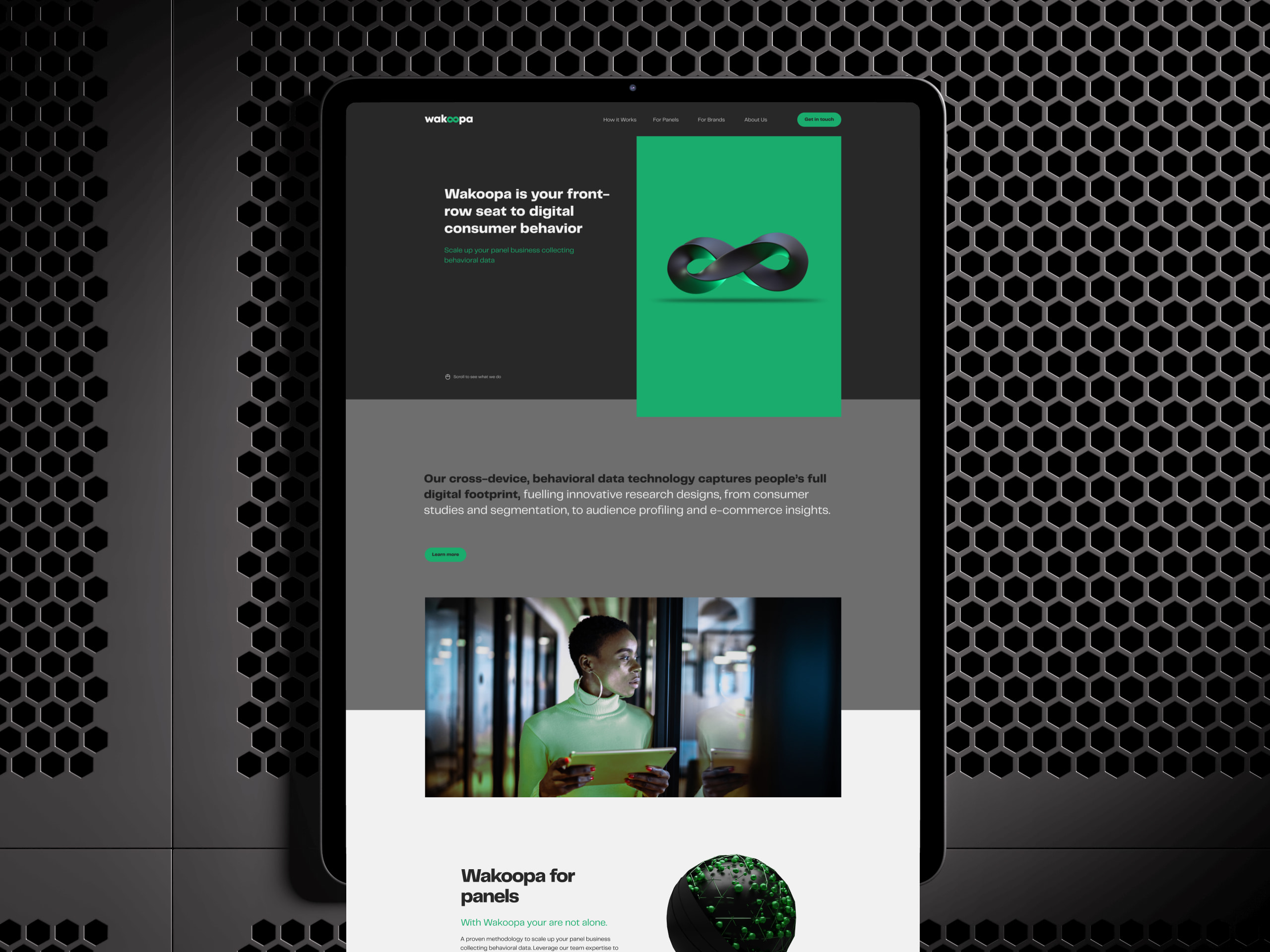
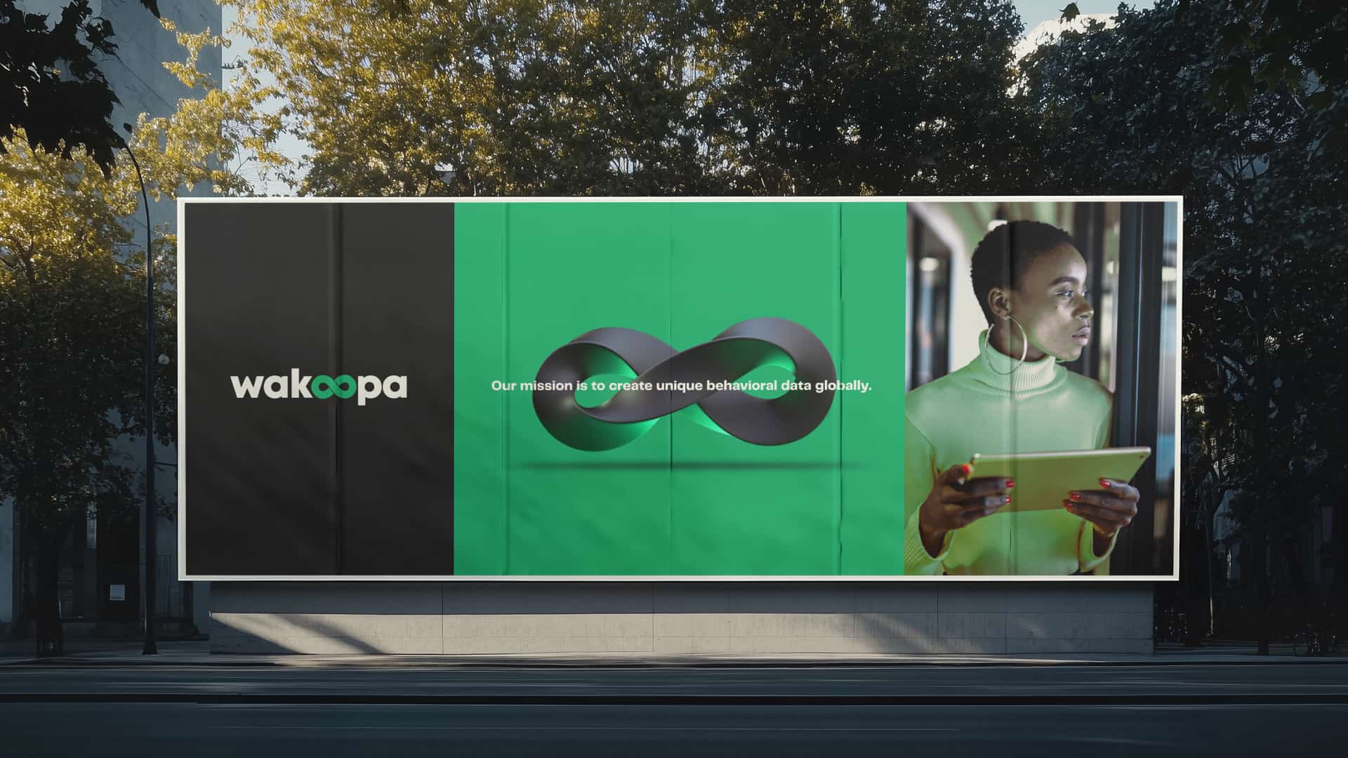
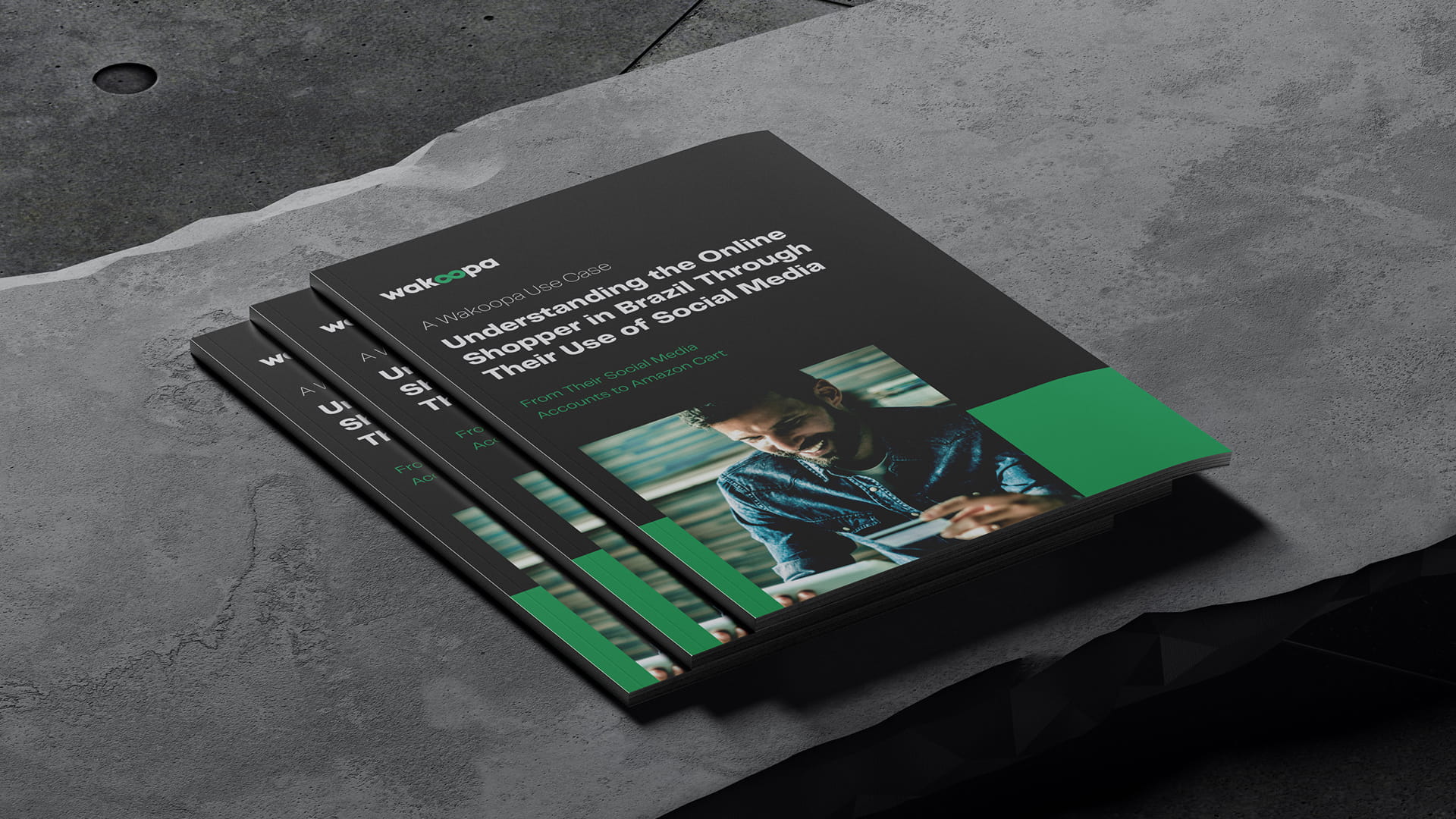
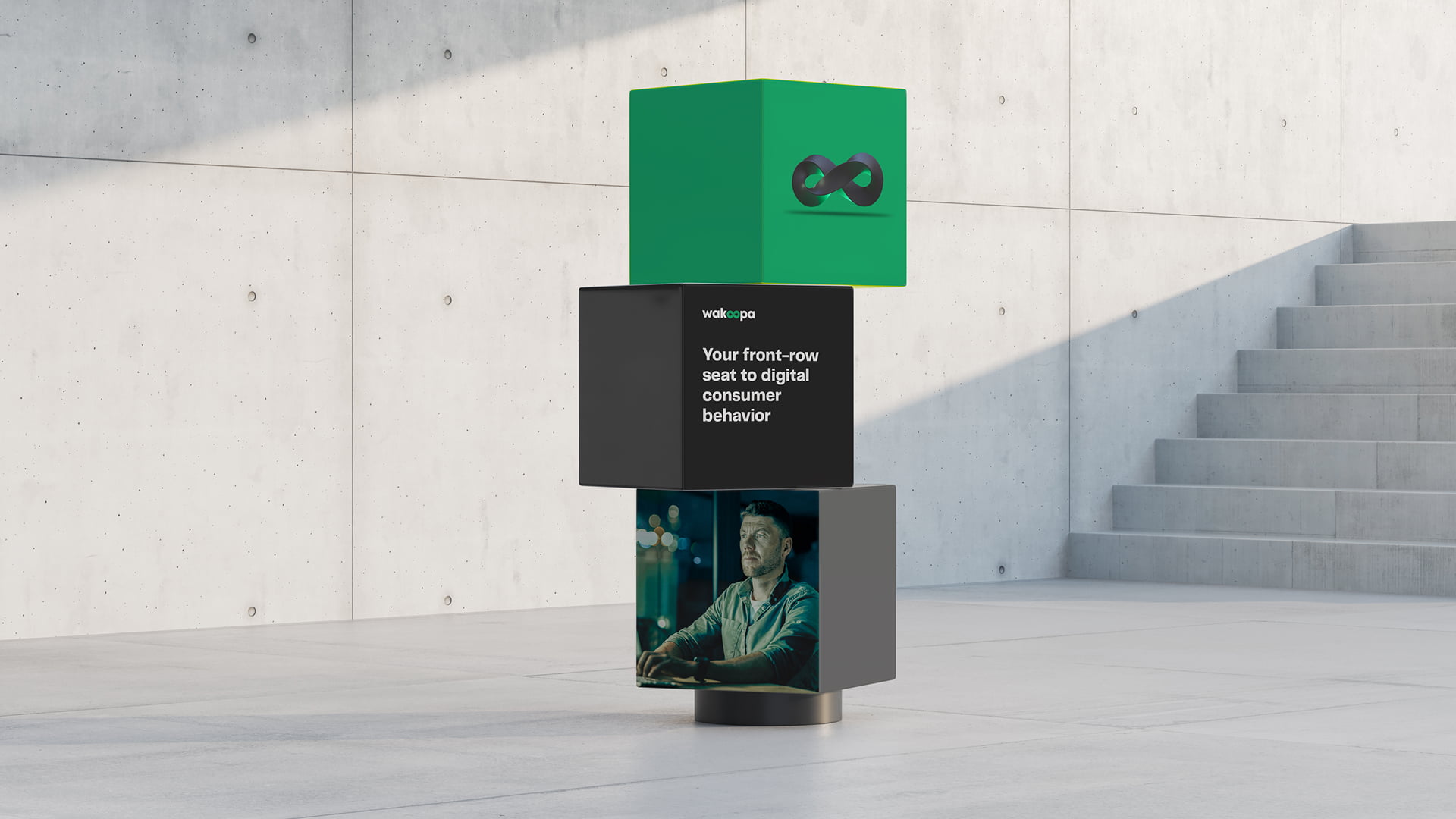
Identity
The brand shifted from orange to a dark and green palette. Black and green belong to terminals, developer tools, and data environments. The identity borrows credibility from the visual language Wakoopa's buyers already trust.


Two journeys
For Panels and For Brands. Two distinct audiences, two dedicated paths. Navigation, messaging, and conversion rebuilt around how each buyer actually evaluates and purchases.


Platform
Information architecture improved, navigation friction reduced, data visualisation patterns refined across core workflows. UX improvements scoped within the existing infrastructure, not a full rebuild.


Website
The site moved from institutional presence to demand generation. Page hierarchy, CTAs, and content restructured around the two buyer journeys. Positioning and clarity first, product detail deeper in the experience.


DESIGN-DEPT.
Barcelona, Spain
Phone: +34 622 712 521
Email: fabioestellita@gmail.com
Linkedin: /in/fabioestellita/
Copyright © 2026 DESIGN DEPT.
All rights reserved.